Energy Consumption consists of 4 main elements. They are:
- Energy Consumption
- Energy Sources
- Energy Consumption History
- Energy Consumption by category (HVAC, Plug loads .. etc.)
- Energy Carbon Emissions
The detailed view of the energy consumption and usage can be accessed by clicking on the ‘detailed view’ button on any of the energy-related cards (marked in green) on the dashboard.
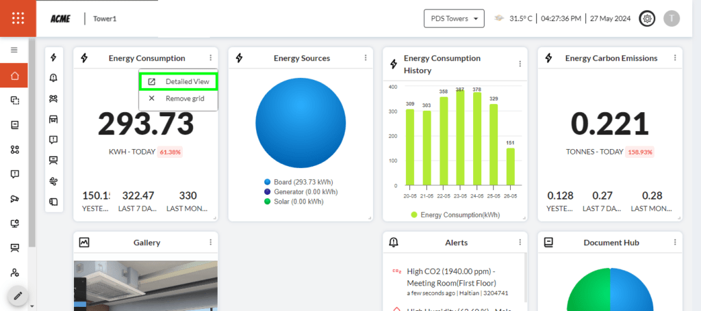
The Energy Consumption and Usage can also be accessed by clicking on the icon in the sub-menu (marked in blue) on the dashboard.
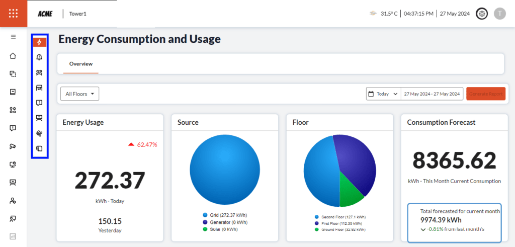
Energy Usage: This shows information about the usage of kWh power on that particular day and the previous day’s usage. Also, it shows the consumption of energy at a specific point in time. It is indicated with a green arrow if the consumption is less compared to yesterday’s reading and with a red arrow if the consumption is more compared to yesterday’s reading.
Source: Shows the power source(s) connected to the building i.e., From the power department, Generator in the building, or Power produced by the Solar panels. Click on the individual power source shown in the legend to deselect and to see the required source only.
Floor: Shows the power consumption on that particular floor. Click on the individual floor name shown in the legend to deselect and to see the required floor information only.
Consumption Forecast: This shows the current month’s consumption, total forecasted consumption for the current month, and the decrease in consumption, in percentage, compared to the last month which is indicated in number and coloured in Green and coloured in Red if there is an increase in consumption, in percentage.
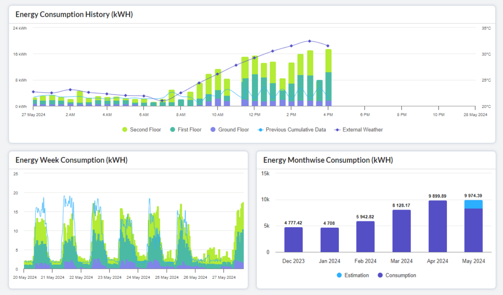
Energy Consumption History (kWH): The graph depicts information about all the floors or of a particular floor depending on the selection from the drop-down. The X-axis shows the particular day and timeline of that entire day. The Y-axis shows the total energy consumption and external weather conditions over a period of time. Also, it shows the data on energy consumption and previous cumulative data of all the floors.
Energy Week Consumption (kWH): The X-axis shows the days of that particular week. The Y-axis shows the total energy consumption on that particular day. When hovering over the graph it shows the cumulative data and all the floors.
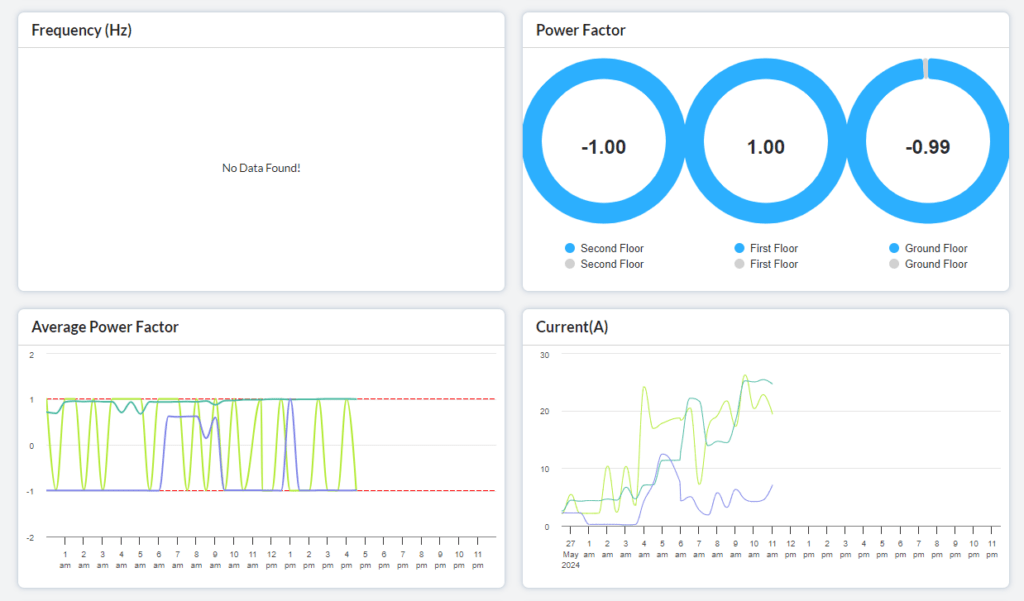
Frequency (Hz): Electrical frequency refers to the number of cycles per second in an AC power system, measured in Hertz (Hz). Commonly, electrical power systems operate at either 50 Hz (used in Europe, most of Asia, and Africa) or 60 Hz (used in North America and parts of South America). The frequency is crucial for ensuring compatibility between electrical devices and power supplies, and it impacts the design and operation of electrical infrastructure such as generators, transformers, and motors. Electrical frequency affects the operation of clocks, the performance of electric motors, and the overall stability of the power grid, making it a fundamental parameter in AC power systems.
Power Factor:
- Power factor is a measure of how efficiently electrical power is being consumed.
- It represents the ratio of usable power to apparent power (total power).
- It ranges from 0 to 1, with 1 being ideal.
- A power factor of 1 means all the power supplied to a circuit is being used to do useful work.
- The power factor is affected by reactive power, which occurs due to inductive or capacitive loads.
- Low power factor results in inefficient use of electricity, leading to increased energy costs and potential equipment damage.
- Utilities often charge penalties for low power factor, inspiring consumers to improve it.
- Methods to improve power factors include adding power factor correction capacitors or using more efficient equipment.
Average Power Factor:
- Represents the average power factor over a specific period.
- Calculated by averaging the power factors measured over time.
- Useful for assessing the overall efficiency of electrical systems.
- Helps in identifying trends and patterns in power factor behaviour.
- Enables better management of energy consumption and optimisation efforts.
- Crucial for utilities and industries to maintain efficient power usage.
In the graph, it is shown how the power consumption is within the boundaries of -1 and 1 threshold for all the floors.
Current(A): This refers to the number of kWh of power consumed on a particular day and time of the day.
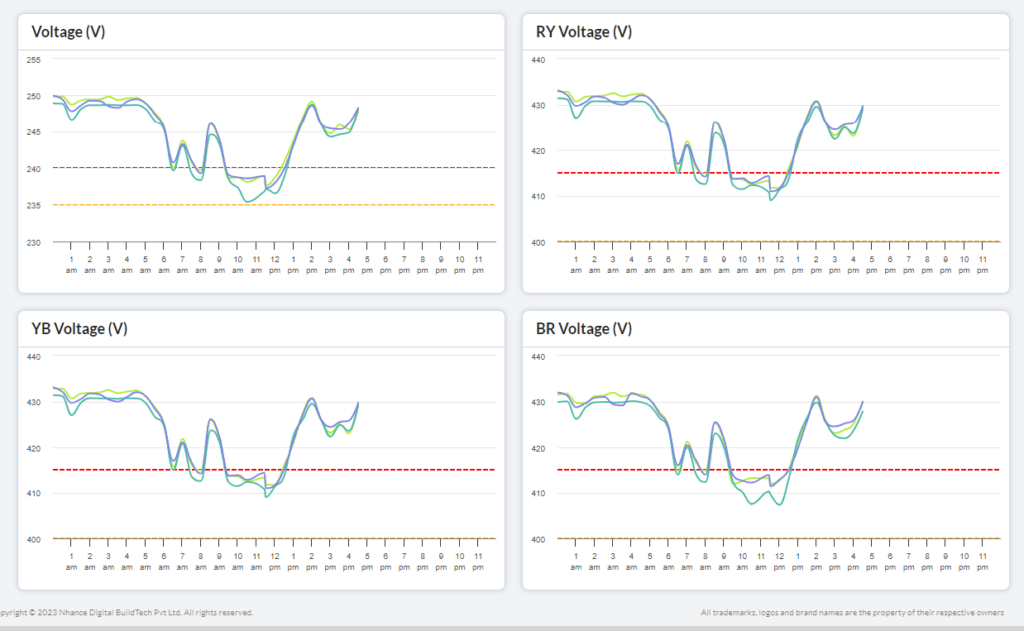
Voltage (V): This graph shows the power usage as of every hour for all the floors.
The X-axis shows the usage for every hour of the day. The Y-axis shows the amount of consumption every hour.
Note: YBR represents the 3 phases in a 3 phase system. Y – Yellow phase, B – Blue phase, R – Red phase. The difference between RY, YB & BR forms line voltage. Phase voltage is the potential difference between 1 phase and a neutral junction point, denoted by Vphase = VR (voltage in red phase) = VY (voltage in yellow phase) = VB (voltage in blue phase).
RY Voltage (V): This graph shows the Red and Yellow phases of line voltage every hour for all the floors.
The X-axis shows the usage for every hour of the day. The Y-axis shows the amount of consumption every hour.
YB Voltage (V): This graph shows the Yellow and Blue phases of line voltage every hour for all the floors.
The X-axis shows the usage for every hour of the day. The Y-axis shows the amount of consumption every hour.
BR Voltage (V): This graph shows the Blue and Red phases of line voltage every hour for all the floors.
The X-axis shows the usage for every hour of the day. The Y-axis shows the amount of consumption every hour.
Energy carbon emissions: Energy carbon emissions in an office result from energy consumption for various activities, primarily due to the burning of fossil fuels to generate electricity and provide heating or cooling. Key sources include electricity consumption by lighting, computers, and other equipment, significant HVAC systems, especially in extreme climates, water heating in restrooms and kitchens, and office appliances like microwaves, refrigerators, and coffee machines.
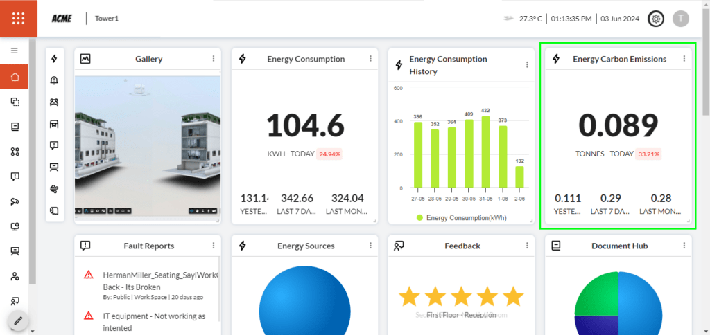
The dashboard (marked in green in the image above) depicts the emissions of the last month, week, and the previous day. Also, it shows the increase in emissions by percentage which is shown in red colour and if there is a decrease in emissions, it would show the percentage in green colour.